What's already great
Keep all of this. Our changes are mostly about getting more people to it, quicker.
- Lure BrowserTick Trout, Jerkbaits and Topwater together and see them side by side. This is your point of difference.
- Setup BuilderSpecies, technique, budget, your setup. It's how the counter works, online.
- The crew's own photosReal people holding real fish on every species. You can't buy that.
- Live stock and dispatch countdownUseful and honest at the moment someone's deciding.
- Reports, guides and cookbook85 fishing report pages, plus the recipes. Good reasons to come back, and good for Google.
- A real shop with real reviews4.6 from 90 Google reviews, with "helpful staff" mentioned 26 times.
Do before launch
In order. Hours are rough, for your developer. Your data and copy jobs are in here too. Please check means we couldn't test it from outside, so it's a question, not a fault.
- Open the site to Google on launch day.robots.txt says "Disallow: /". Right for now, but it blocks search engines if left in place. Check page-level noindex at the same time.15 min
- Put a real order through. Please checkDesktop and phone, shipping and Click & Collect, failed card, confirmation email, last unit in stock. We only saw the look of it, and it looks fine.Half a day
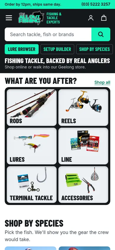
- Show the categories first on the homepage.Six tiles in the first view, instead of seven full-width photo panels with no category, price or product.6 to 10 hrs
- Rebuild the header.Logo left, big search, phone right, categories in a bar. Desktop only has a search icon today.1 to 2 days
- Fix mint text on light backgrounds.1.44:1 on white, and the guideline asks for 4.5:1. Mint as a fill with dark text is 12.36:1, so the colour stays.2 to 4 hrs
- Fix "Estruary".The typo is on 375 lures and shows in the Lure Style filter.15 min
- Take the drinks out of Rods.23 drinks (Coke, Red Bull and friends) are filed as fishing rods, plus 4 snacks in Accessories. If they're till items, keep them off the web.15 min
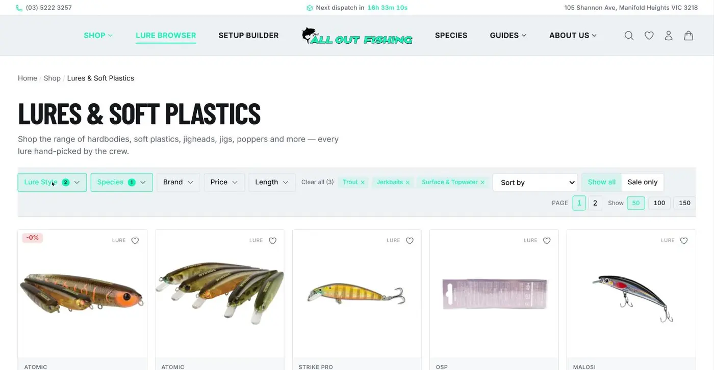
- Remove the "-0%" badge.It's on a lure in the trout results. Looks like a 9 cent sale: $19.90 against $19.99 on an Atomic Hardz. Hide any badge that rounds to 0%.30 min
- Confirm one consistent range figure. Please checkThe site says "9,000+" and "5,000+". The search index has 2,253 listings. Peri, what's the real count once variants are in?5 min
- Lead with products that have photos.30.5% of listings have no image. Search already ranks those last. Make every page and home section do the same.1 to 2 hrs
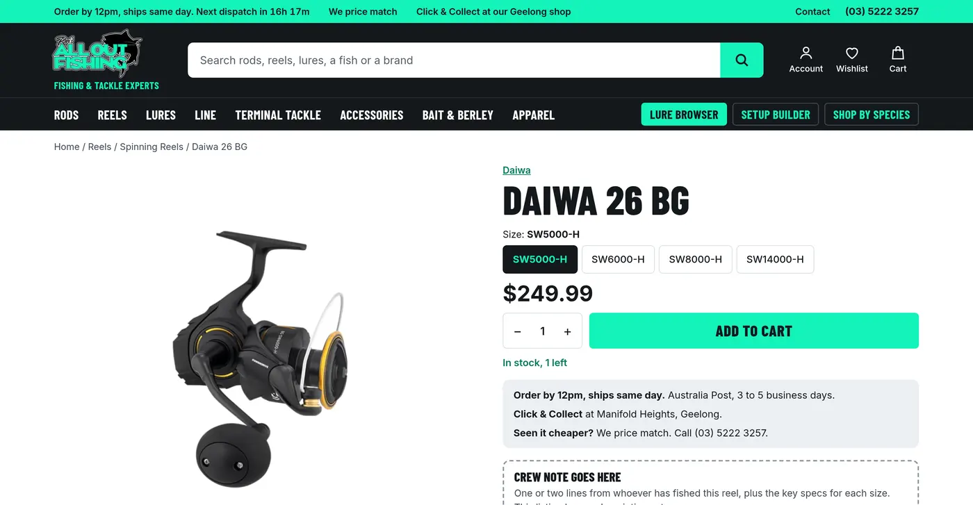
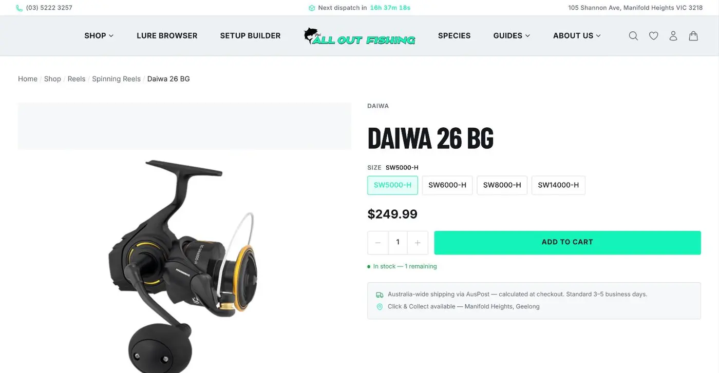
- Remove the grey band on product pages.An empty block sits above the main image on the Daiwa 26 BG and Berkley PowerBait pages.30 min
- Spell out the 10% offer. Please checkThe home page promises 10% off a first purchase with no conditions next to it. Test it, say what it excludes, and how it sits with price match.1 to 6 hrs
- Show postage rules before checkout. Please checkLong rods and frozen bait are the ones to test. Are they collect only? Is it clear before someone's at the payment step?4 hrs to 2 days
- Swap the odd copy."Stripe. No platform cut." means something to you and nothing to a customer. "Secure checkout" does the job. Also give each page its own title: five share one today.1 hr
One to recheck: the Flathead page showed Dirty Grub repeated with "Image coming soon" when we looked, but the search data doesn't show it, so it may be sorted or fixed already.
Before and after
Drag the handle across. All real products and prices from your site, your logo and your crew's photos.
Homepage, first view
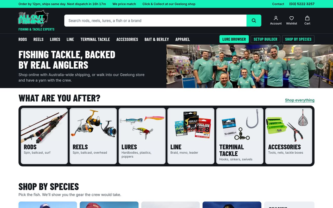
Walk into the shop and someone says "G'day, what are you after?". The homepage should do the same.
Header
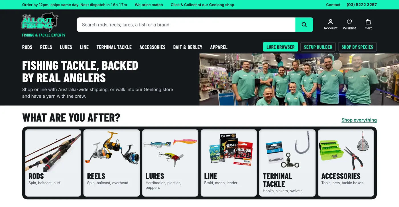
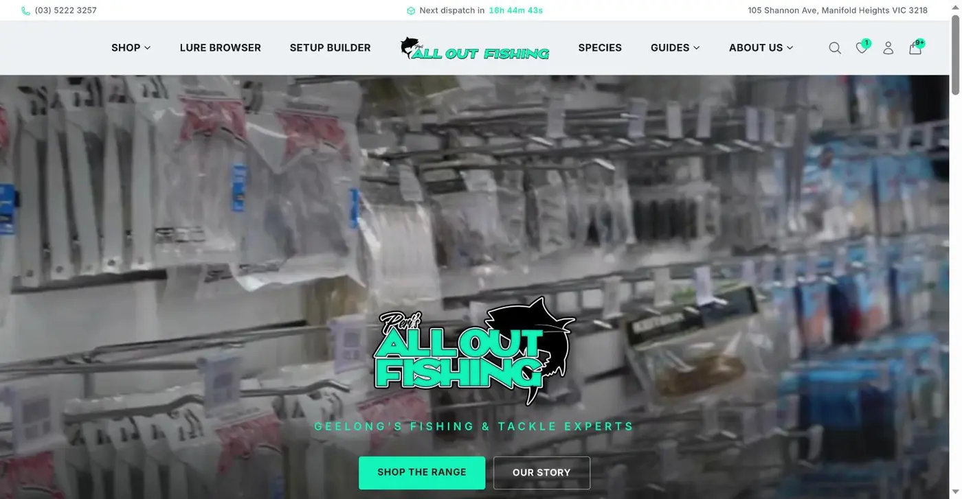
Logo left, search you can't miss, phone top right, then categories. It's the layout people already know from Bunnings and Kmart.


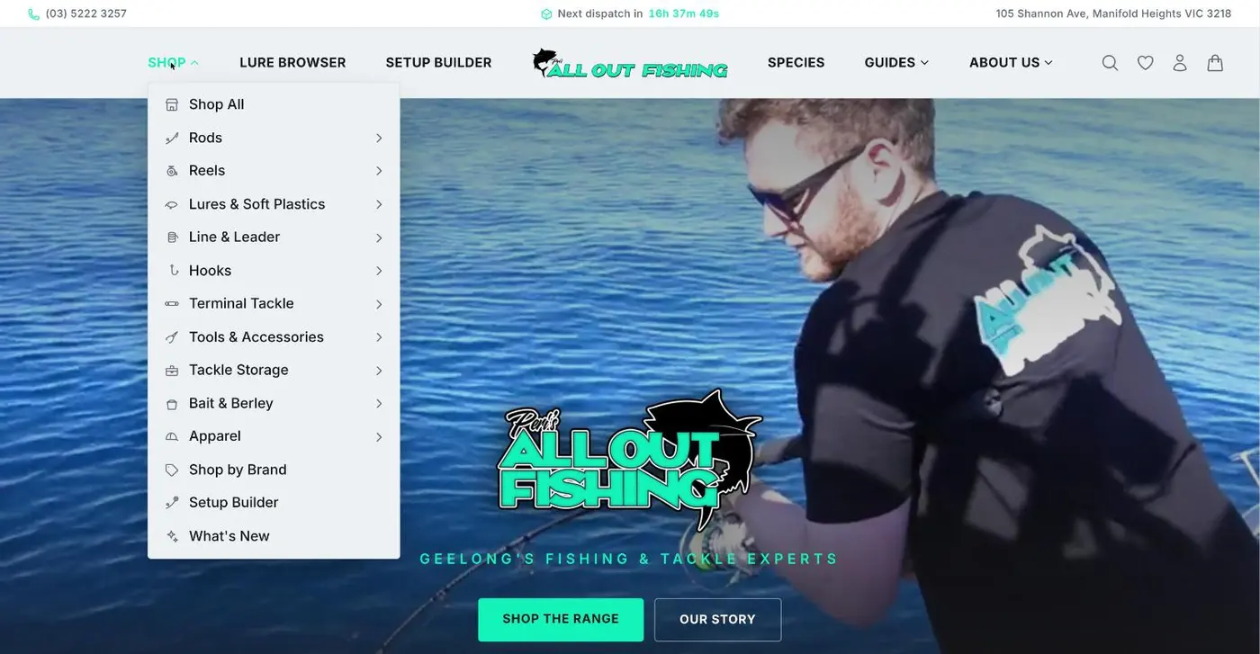
Menu
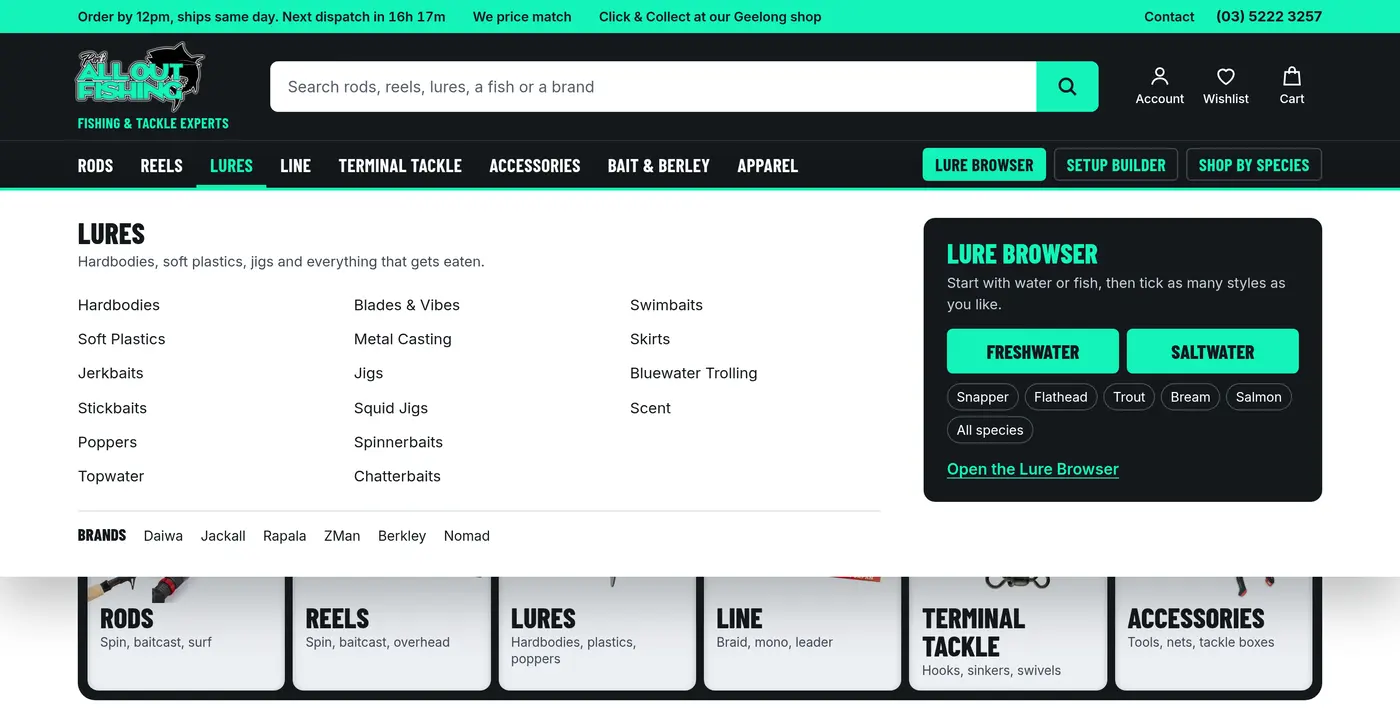
Fourteen rows of names become one panel per category, with the tool beside it: hit the problem first, then the solution.
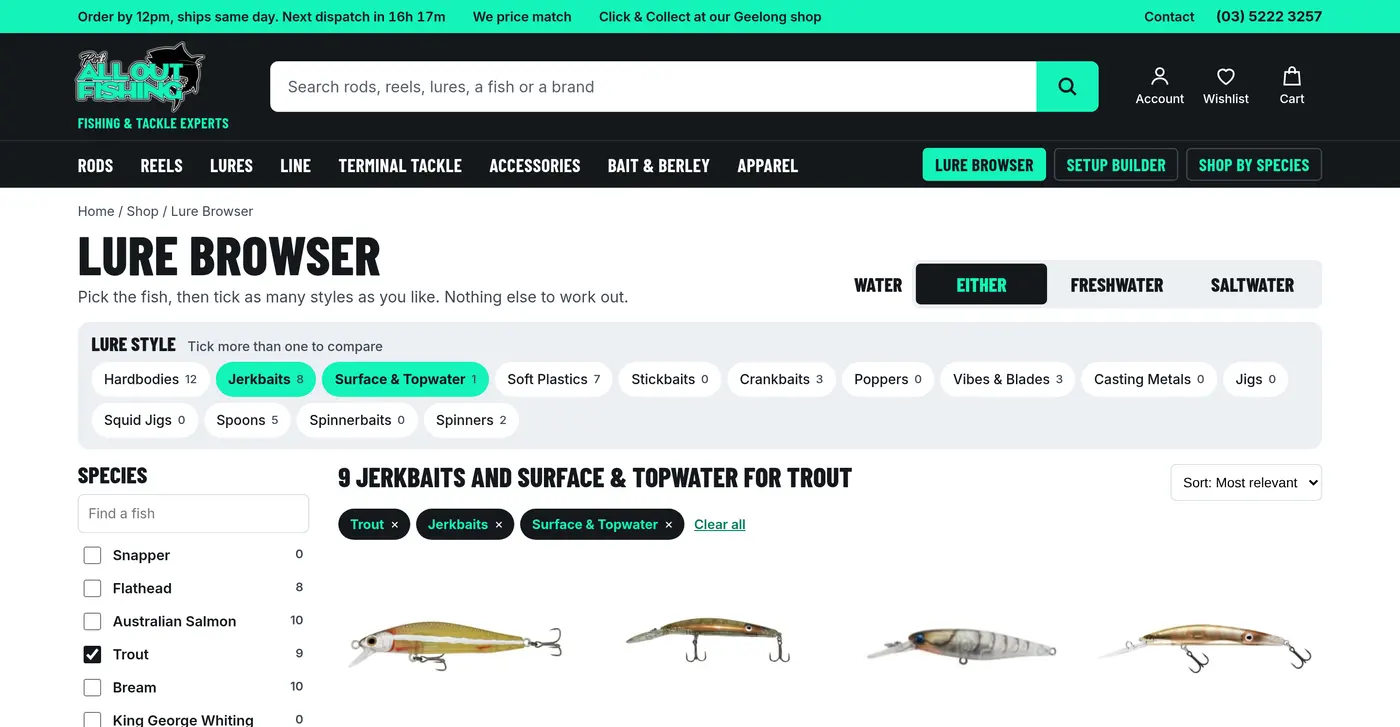
Lure Browser
Peri's trout example. Same clever filter, but the styles are out in the open, Species comes first and Fresh or Salt is one optional tap.
Product page
Small fixes only: no grey band, selected size you can read, and a link to finish the setup.
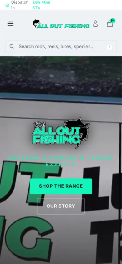
On a phone
Most of the first screen goes from video to the six things you sell.
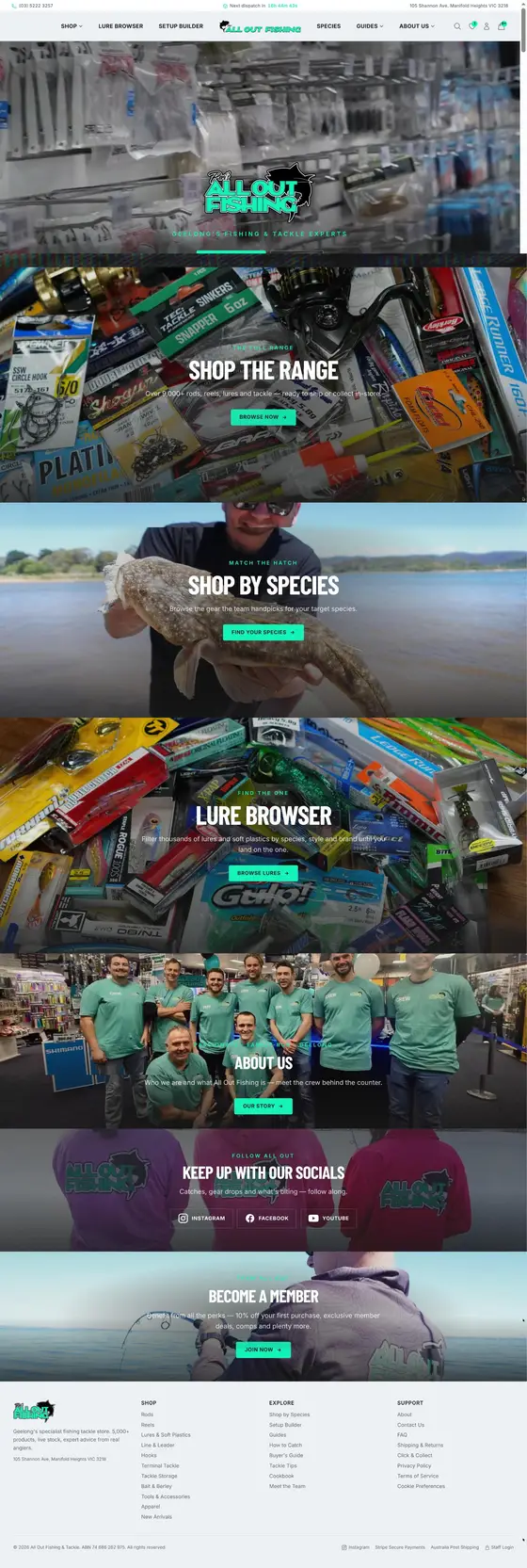
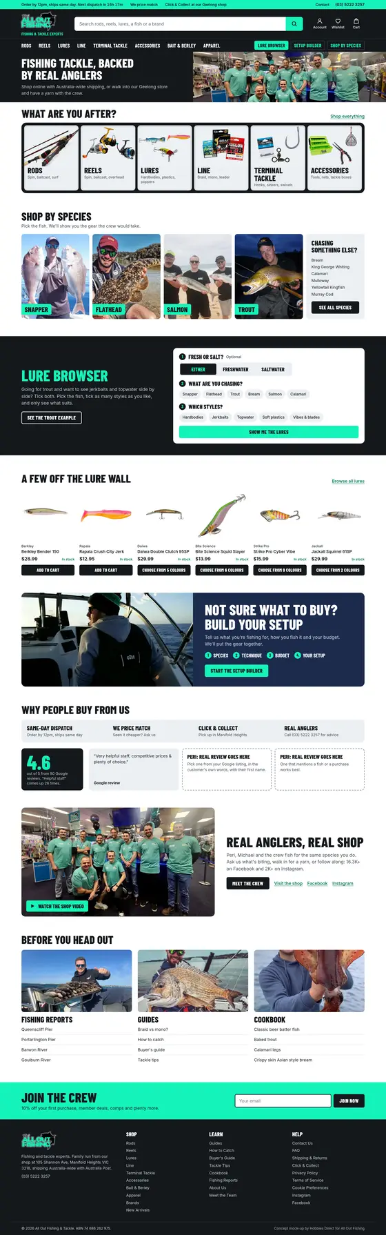
The whole homepage
Same content you love, in a different order. Scroll each one: shopping first, then trust, then the crew, the reports and the recipes.
All the feedback
Everything from our chat, plus a second look we had done afterwards. Tap a heading to open it.
Homepage The big one
- Get people buying or browsing the moment they land.Right now it reads like a great About Us page. Don't be scared to sell to them. Hamish, Angus
- Six category tiles: Rods, Reels, Lures, Line, Terminal Tackle, Accessories.The six you both named. Hamish suggested three products per tile so it reads at a glance. A second look suggests one recognisable product where that's clearer. Hamish, Peri, Michael, second look
- Think of the shop floor."Hey Peri, I'm after a rod", and you walk them to the rods. Shop All is pointing at the door and saying go for it. Every click removed takes strain off the brain. Hamish
- Keep the video and make room for shopping.Michael said video draws you in, and we agree it builds real trust: you see the shop and the crew. It's also 6.6 MB, which is heavy on 4G, and it pushes the shopping down. Michael suggested keeping the video with categories underneath. Our proposal keeps both, with categories first and the crew film lower down, played on request. The mock-up homepage measured about 0.5 MB on first load, because the film only loads when someone presses play. Michael, Angus, Hamish
- A site people enjoy being on.Peri's vision stays. Guides, reports and the cookbook bring people in from Google and YouTube, and they sit right after the shopping. The site's job is finding the product and making it easy to buy. Peri, Angus, Hamish
- Earn trust from people who've never met you.Bring in Google reviews (4.6 is good, nobody expects 5), and make promises: same-day dispatch, price match, your range. Hamish
- Species shortcuts: the main four, then "see all".Serve most people in one tap. The mock-up uses Snapper, Flathead, Salmon and Trout as a starting guess: you know the real four. Hamish
- Feature lures.Peri's point: anglers collect them and find any reason to buy. So they get their own section and a rail on the home page. Peri, Michael
Header Top of every page
- Logo far left, "Fishing & Tackle Experts" under it.It answers "am I in the right place?" straight away. Angus, Hamish
- Big search bar.Expand it to take over those links. Stores with prominent search see more people use it. Angus
- Phone and Contact top right, address out of the top strip.The phone number is a strong trust signal. Your customers shop at Bunnings and Kmart too, so lean on what they already know. Angus
- Guides and About Us go to the footer.That space is your most valuable real estate. A second look suggests keeping one small "Advice & Reports" link up top, since advice is part of what you sell. Angus, second look
- Categories in a bar, with a mega menu.Setup Builder appears when someone's looking at reels or rods, Lure Browser in Lures with Fresh and Salt ready to go. Let them hit the problem, then show the solution. We pushed our own parts finder too hard early on. Angus, Hamish
- Lure Browser keeps prime spot.Angus pointed out Lures and Lure Browser go to the same page. Peri wants it visible because it's the point of difference. Our recommendation after the review: keep it as the highlighted button in the bar and a home page feature, with both links landing on the same page. Peri, Angus, second look
- Geelong: out of the headline, still on the page.We said drop it so you don't pigeonhole yourself, and go Australia-wide. A second look adds: "our Geelong shop" and Click & Collect are proof you're real, so keep those. The mock-up does both. Angus, Hamish, second look
Colour Mint stays
- Mint text on a light background is too hard to read.1.44:1 on white and 1.25:1 on the header grey, against a 4.5:1 guideline. We darkened our own theme colour for the same reason. Angus
- Use it as a solid fill, or on dark.Dark text on mint is 12.36:1. For links on white, a dark teal (#067a5e) is 5.31:1 and still feels like you. Angus
- Michael's black header.Michael tried it during our chat and it pops. Your shirts are dark too. The mock-up runs with it. Michael
Lure Browser Make the best bit easier
- Drip-feed the choices.People only digest so much, so make the first decision a simple one: Fresh or Salt. Peri says most styles work in both, so it stays optional and never blocks shopping. Hamish, Peri, second look
- Your data already supports it, for lures.Of 633 lures, 323 are both, 148 salt, 98 fresh and 64 untagged. Show untagged ones in both views until the crew tags them. Second look
- Species first, on the left.People say "I'm going for snapper" first, then pick a style. Everyone agreed on this one. One of the crew
- Lure styles out in the open.Keep the multi-select, but as visible chips, so people find it without opening a dropdown. Water types then come out of the style list. Hamish, second look
- Tidy the species list.Estuary, Inshore, Freshwater and a few others sit alongside real species. Keep those as their own filter. Second look
Words Sound like the counter
- Use shopping language.Guides, species and setup felt like tutorials to Hamish as a non-angler. "Shop by species" fixes it in three words. Hamish
- Keep real tackle words, add a plain line."Terminal Tackle" is the right word, with "Hooks, sinkers, swivels" under it so everyone follows. Peri, second look
- Read every line as if you were saying it.Peri already caught lines that aren't how you'd say it. Remove long dashes and check every claim is accurate and sounds like you. The mock-up's copy is a starting point for you to change. Peri, Angus
Launch Soon
- Launch and tweak.Perfect never ships, and early traffic is lower than you'd think. Spend the time on the homepage and header, do the list above, and go. Hamish, Peri, Michael
- Keep your checkout design.It's familiar, which is what a checkout should be. Just prove it with a real order first. Hamish, second look
- Test Setup Builder before promoting it hard.Only 3% of reels and 5% of rods have species tags, against 90% of lures. Run a few real builds and check they make sense, then soften "perfect" until you're happy. Second look
After launch
The ambitious bit, in the order we'd do it.
- Real Google reviews on the home page. Peri picks the best few, with permission to show them. Two slots in the mock-up are waiting.
- Photos and descriptions, top sellers first. 62.4% of listings have no description. Don't try to do everything: start with what sells.
- The crew tags rods and reels by species. That gives species shopping better coverage of rods and reels. Check the other categories and test complete setups too.
- Track what people search for. Searches with no results tell you what to stock and what to rename.
- Link reports to products. "Flathead are on at Queenscliff" with the three lures that are working is the shop counter, online.
Where the advice comes from
Some of this is our own experience running Hobbies Direct. These are the public sources we checked.
- Baymard: homepage product-finding paths
- Baymard: prominent search fields
- Nielsen Norman Group: mega menus
- Nielsen Norman Group: search as a visible box
- Baymard: selecting multiple filter values
- Baymard: promoting key filters
- W3C: contrast minimum (4.5:1)
- web.dev: video performance
- web.dev: loading speed target
- Spiegel Research Center: online reviews and sales